Posts

Showing posts with the label Shop Your Stash

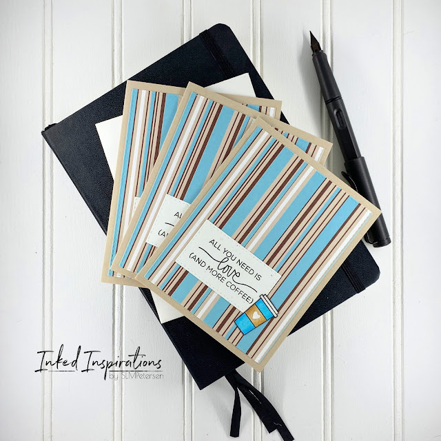
Creating Multiples - All You Need is Love & More Coffee
Image
Do you create in singles or multiples?  I do both.  Multiples can be anything from two to six or more.  When I create multiples I often create them with patterned paper.  This is determined by how much of a specific pattern I have, it dictates how many of a card design I can create.   For today's cards, I had enough striped paper to create three cards.  I let the paper dictate the color palette for the card designs.  When I pulled these stripes from the basket I felt a coffee shop vibe, so coffee cards they became.   These stripes are bold and can carry a card on their own, so I needed a bold sentiment and a little embellishment to keep them clean and simple.  I pulled a sentiment and coffee cup from the Technique Tuesday Perk Up stamp set.  I used my favorite set of stitched rectangle dies to cut both the pattern paper and sentiment block.   I used my Copics to color my coffee cups to match the patterned paper. ...
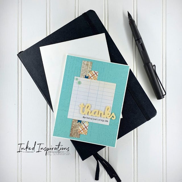
Thanks Trio - Using Die Cutting Diva’s CC Sketch #56

Image
Today’s trio of cards were created with pattern paper scraps and a few die-cuts from my stash. For a while, I subscribed to the theory that if I cut a bunch of die cuts at once I would have them ready to use.  The problem with this is that I began storing them and never using them. As a general rule whatever I already had cut was the wrong color for the card I wanted it on. As a result, I would cut a new one and never use the ones I had pre-cut in my stash.  Now I’m in use it up and quit storing mode. For these cards, I began with Die Cutting Divia's CC Sketch #56 from January 2017 and collected a few strips of patterned paper from my scrap stash. For each card, I selected patterns that worked well together and then found a solid color to fit the color palette for my card panel.  I stamped the solid panel with the Prima Iron Orchard Texture stamp using VersaMark Ink for a tone-on-tone effect.  Once stamped, the panel was added to a white card base. I layered strips o...

Scrap Busting - Holiday Tags

Image
If you're like me, then you have a stash of scraps. Scraps in all sizes, shapes, colors, and especially patterns.  I'm terrible about hanging onto even the smallest of patterned paper scraps.  So today, we're talking about making tags for the holidays.  I have six ideas for tags today, all from scraps in my stash.  I started this project by pulling my file of Christmas and Winter paper scraps.  To fill in a few of the gaps I added patterned paper that matched the color scheme for each set of tags.   My goal was to use only scraps for these tags.  I pulled some of my tag dies and began cutting my scraps, sorting them into color schemes as I went.  I also cut enough white to back each tag.  I stamped the back of each tag "to" and "from" and added sting to each to finish them. Gingerbread men seem to be synonymous with Christmas, so I couldn't help but make a set of tags with them.  For the tags, I used the Pink Fresh Studio Stiched ...

Freshly Made Sketch #197 - Trio of Butterfly Cards

Image
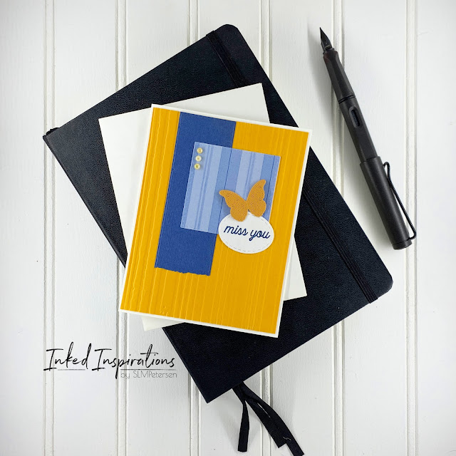
These cards are from a few weeks ago when I was focused on combining the use of card sketches with my scrap stash.  For these three cards, I used Freshly Made Sketch #197 and a few elements from my embellishment stash. For this first card, I worked with a complementary color palette of blues and yellow oranges.  I started by running the yellow-orange card stock through an older Tim Holtz Texture Fades embossing folder called Stripes and adhered it to a white card base. Then I began laying my elements, starting with a banner of textured dark blue that I cut using the Homenty Bee Stamp Banner builder dies.  Layer three is a square cut using some older patterned paper and the Art Impressions Stitched Squares dies.   I added the sentiment using a stitched oval cut with Simon Says Stamps stitched oval dies and stamped “miss you” with a stamp set from My Favorite Things.  To complete the card I added a butterfly cut from a dark shade of yellow-orange cardstock u...

Stitching - Just Because Frog

Image
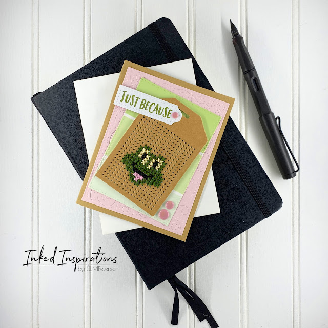
Sticking on cards has been a way for me to combine my past hobby of embroidery with my passion for card making.  I usually stitch when we travel to "town," which is about a two-hour drive.  Living in a small town in rural Alaska, means we have to travel for some things like doctor appointments and a larger selection of groceries.   With this card, I've also tied in another little thing I like to collect, paint chips.  If the paint chip is a head-scratcher let me explain.  I'm an artist first and foremost and I love the color.  I will seek it out anywhere and all the paint chips in a hardware store are like candy to me.  I wish I could remember where I learned you could use a white plastic eraser to remove the text on paint chips, but that was a game-changer for me!  Now I could use them like any other paper in my card-making.  I started this card with the happy frog face and selected a color palette of pink and green to build the card....

Tying the Knot - Abstract and Florals

Image
I'm back with more abstracts.  I told you that I loved this technique!  I also recently bought some additional stencils specifically for this technique that I'll be sharing soon.  Why do I love this technique so much?  Let's start with the fact that there are so many design possibilities.  It lends a modern touch to cards when using soft colors.  It can make a statement with the use of bolder colors.  Layering colors and stamps never creates the same design twice.  Today's card is a soft modern take on a wedding card. I started this card with my Distress Inks and stencils.  I always build my abstracts by starting with the largest elements first, then filling in with smaller elements as I go.  This panel began with my largest shape and Bundled Sage, then I added Saltwater Taffy, and finished by adding Salvaged Patina to balance the composition.   I pulled a couple of Simon Says Stamp stamp sets from my stash and added my floral ...

More Ink Blended Balloons Card Ideas

Image
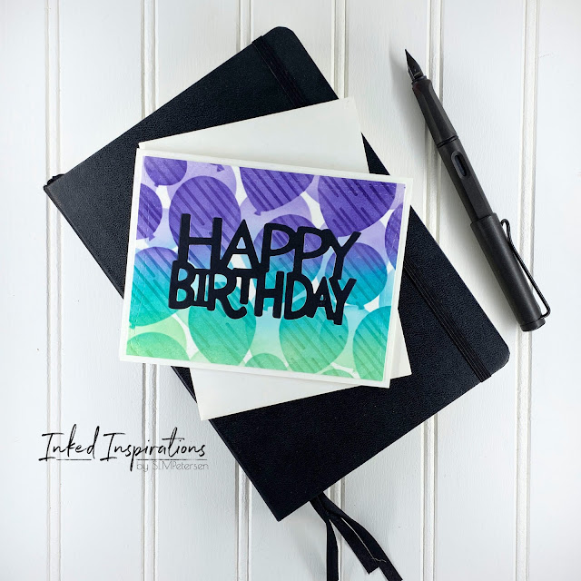
When I had my Honey Bee Layering Balloons Stencils out for the cards I talked about yesterday, I actually created four backgrounds.  I turned those backgrounds into six cards.  To see the first four cards check out yesterday's post -  Inspired by Kelly - Two for One Balloon Cards . For the first card, I used Distress Ink in Villanous Potion, Peacock Feathers, and Cracked Pistachio to build my layered balloon background.  I cut three of the Pretty Pink Posh Happy Birthday sentiment and glued them together to build some dimension.  Keeping things simple I added the A2 panel onto a white card base and glued the sentiment in the lower half of the card. For card two, I used Mustard Seed, Peacock Feathers, and Salty Ocean.  I pulled the Absolutely Fabulous dies from My Favorite Things and die-cut the top portion of the panel.  Next, I adhered the balloon panel to a white panel and die-cut the two layers with the largest of my stitched rectangles.  I sta...

Inspired by Kelly - Two for One Balloon Cards

Image
The inspiration for these cards came from the archives of Kelly Taylor's videos -  Layering Balloon Stencil 5 Ways: Birthday Parties .  Knowing I had these stencils in my stash I dug them out and set out to ink blend a few panels.  I wanted to try a couple of the ideas I saw in her videos.   I ink-blended my balloons using Distress Ink in Villainous Potion, Peacock Feathers, and Cracked Pistachio onto my first panel.  I wanted to add more interest, so I pulled out another stencil and layered it over the second layer of balloons, while the balloon stencil was still in place, and added some tone-on-tone details.  Once I had a completed panel I wanted a bold sentiment, but instead of adding the sentiment over top of the panel, I opted for a die-cut inlay.  Which left me with the reverse, which I could have tossed or used later.  Instead, I made two cards for the price of one.   Rense and repeat.  This go round I used Mustard Seed,...

Learning to Use Card Sketches

Image
I've drawn my own sketches off and on over the years, very often to get an idea out of my head when I'm not in the studio to create.  I've never sought out card sketches, nor have I actually used them to build my cards, other than my own of course. Then a few weeks ago my Bestie over at By Grace Everett and I were talking about patterned paper and getting more than one or two designs from some of our patterned paper.  Which got my wheels turning.  I was trying to think of where we could get more inspiration to use our patterned paper, then it hit me.  We needed to watch a few of Kristie Marcotte's videos .   Fast forward to a couple of days ago when I was sipping my morning coffee and seeking inspiration.  I clicked on one of Kristie's older videos where she showed how to use one 6x6 paper pad to make 34 cards .  This is exactly what we needed to jump-start our patterned paper use.  She took one double-sided paper pad and eight card sketches...

Clean and Simple Abstract Wedding Card

Image
I'm sure you've guessed by now that the abstract technique has taken up permanent residence in my card-making repertoire.  Because I use stencils to build my abstracts and I love ink blending, the possibilities are endless and the options infinite.   If you like the abstract look you want to check out my posts Inspired by Mindy Egan - Abstract Card , More Abstract Card Ideas , and Drawing Inspiration from Outside the Card Making Realm .  Today's card is a modern wedding card. I started this card by ink-blending my abstract composition.  I started with Dried Marigold and the largest shape then added the next largest shape with Saltwater Taffy, and finished with the small shape in Speckled Egg.  As I built the composition I wanted to retain a large white space in the middle.  Once I completed the ink blending, I trimmed the panel with the retired Sizzix Dotted Rectangles largest die. I added the dress and the stacked sentiment using VersaFine Black....

Limiting You Color Palette for Copic Coloring

Image
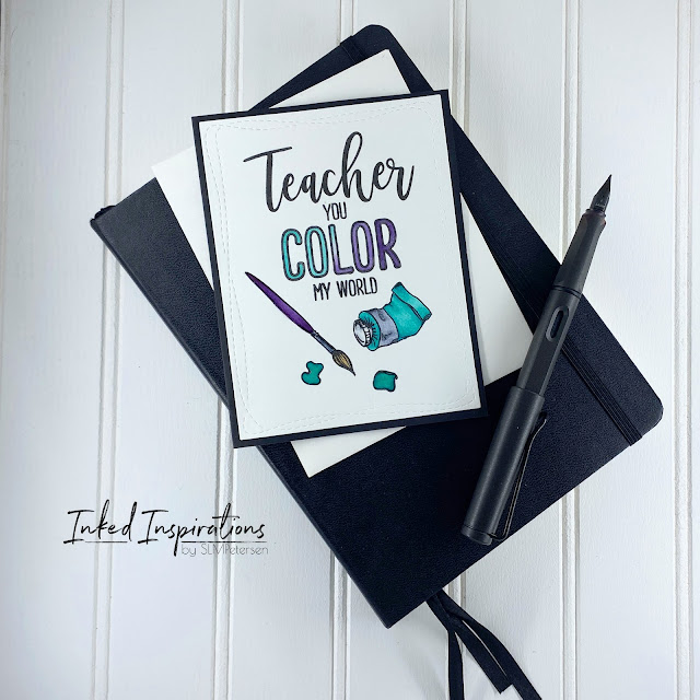
Today I have two more teacher cards for you.  I used Teacher from Waffle Flower and Color My World from WPlus9 to build these.  I kept the design simple with some Copic coloring, using a limited palette.  Limiting your color palette can be a great way to challenge your creative skills. Each card was stamped, colored, and then cut with the Simon Says Stamp Wonky Rectangles dies.  In order to get the "teacher" to line up the way I wanted I stamped the "you color my world" portion first, then removed that stamp from my platform.  Then I lined the "teacher" sentiment up and stamped it.  After I had my sentiment in place I added to brush, paint tube, and puddles of paint to the panel.  With my layout complete, I opted to Copic color these images, with my limited color palette selection and I gotta say the results are so fun!  I love these colors together.  To complete the simplicity of these cards I adhered them to a black card base.  

Cute Teacher Card Ideas

Image
When I'm in the making groove I make dozens of cards a week.  Yes, I said dozens.  Since I only write five posts a week I have photos of dozens of cards that have yet to make it to the blog.  Today's cards are from the teacher cards I made a few weeks ago. The layout for both cards is the same, with the exception of the card above having a few green heart embellishments.  These cards pull together several brands.  I used the Teacher from Waffle Flower, Kindness Matters from Neat and Tangled and one of the past Stamptember sets from Simon Says Stamps. To add variation I colored the puppies in different colors, but the green combo is the same on both cards.  I had only intended for the difference to be the color of the puppy and the color of the card bases, that this until I dropped a green marker on one panel.  How better to hide a mark than with a green heart, but one heart looked very out of balance.  I gravitate toward odd numbers when using emb...

5 Take Aways During No Spend October

Image
At the end of September, By Grace Everett and I were talking about all of the product we had purchased and how much stuff we had from previous hauls that we had yet to use.  Then I proposed a no spend October and my bestie was all in.  Before I continue onto what I learned so far, let me state that we've done this before, but this was the first time we had a zero tolerance for buying anything.  Let's talk about what I learned about my crafting self. Take Away #1 - You will use what you have if you stay out of the stores and stop filling shopping carts. Yes, that seems obvious, but I'm talking about the things you bought and tucked in a container and forgot about.  Those enamel dots, wood embellishments, fancy florals, washi tapes, etc.  I've been using up the impulse buys that are stashed in my studio and it feels good.  Take Away #2 - Inspiration will come from other places.  I've recently gotten hooked on using card sketches.  Yes, I'm probab...

Shopping Your Stash - Playing with Fun Folds and Windows

Image
Sometimes I see techniques and think "Nah, that's cute but not really for me", but then I hit a creative wall and pick something to challenge my creative ideal.  Fun folds and windows are two of those "Nah" techniques.   Before I go into the details of this make, I really want to encourage you to shop your stash.  Any dies and stamps will work for this technique combo.  Large shapes are great for windows and any cute stamp can peek through.  Color your image with your favorite medium.  I think flowers would be a fun window card peek through as well. This card started with the polka dot paper and inspired my color palette.  Jumping off from there, I pulled a second scrap of patterned paper and Copic colors that would fit my palette idea.  After I had a color palette I shopped my stamps and dies for further inspiration.   While shopping my stash, these cute Darcie's penguins came into view.  Bingo!  This little penguin in pi...

Mini File Folder Card Idea

Image
The envelope punch board occupies space in my studio, but it's rarely used.  I won my punch board as a giveaway ages ago and I rarely make my own envelopes.  I'd seen some cute ideas on Pinterest for using it to make file folder tabs on cards but had yet to try the idea.  Then a couple months ago I had a request for office goodbye cards.  Is there a more perfect card idea for office cards than a cute mini file folder?  I think not! I started with an A2 card base, punching a tab on one side, then trimming the opposite side of the card to build my file.  If you're looking for exact measurements for creating the tabs,  this is the tutorial  I took my inspiration from. I added a gift card pocket using my Honey Bee Stamps pocket die.  Because of the style of the card, I put the interior panel for the note on the front side of the card and the gift card pocket on the back.   I kept the design simple using patterned paper scraps, rounding...

Drawing Inspiration from Outside the Card Making Realm

Image
I thought we'd start the week by talking about inspiration and where to find more ideas.  Back a couple of weeks ago I talked about being inspired by Mindy Egan and her Abstract Art for Clean & Simple Cards . I really fell in love with this technique and have made several cards with this technique.  After I'd created a few abstract designs I went down the Pinterest rabbit hole.  I dropped abstract cards in the search bar and found tons of inspiration for layout ideas and color combs.   Pulling inspiration from somewhere other than your own art niche can bring to light different color combinations, new ideas for design elements, and even new techniques.  While my main focus is on creating cards, I draw inspiration from fabrics, photography, watercolor, tile, home decor, and so many other places.   For this card, I drew color and design inspiration from a  business card design  I saw on Pinterest.  To start my design I opted for...

Watercoloring the MFT Floral Fantasy

Image
Watercolor is a technique I love, but it's a challenging technique that I'm always learning.  The only thing I know for sure is no matter how many times you work with watercolor you will never get the exact same results twice. I used the same technique for this Floral Fantasy card that I did when creating the peonies in the Technique Tried - Watercoloring Floral Focal Point post.  What I learned while watercoloring this image was that adding shading was a bit more challenging.  This image has a lot of details drawn in by the illustrator.  By heat embossing the image, I created a lot more nooks and crannies to paint.  I feel like this image will lend itself to coloring more easily without the heat embossing. The end result made for a pretty card, but I wouldn't use this technique with this image again.  In the future, I would stamp and color with watercolor or Copics, or I would heat emboss it in a metallic for a clean and simple elegant effect.  The ...

Up and Away from Concord and 9th - Scene Cards

Image
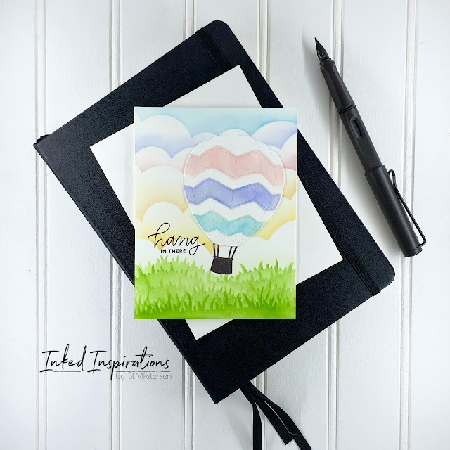
I have an unhealthy way of dealing with stress.  I shop.  I don't just shop for anything I shop for card-making supplies.  While cruising the shops as one does I came upon these fantastic balloon dies!  I had to snag them and the match stamp set.  The moment I saw them I knew exactly what would happen when they arrived in my studio, there would be a scene card filled with clouds!  I built several scenes with these balloons.   When I started the balloon card project I  really had no intention of using the grassy hill stencils.  I had a vision of clouds and balloons, nothing more.  As I blended my rainbow of clouds I decided the scene would not be complete without a bit of green.  I made backgrounds before I created my balloons.  In the end, I liked the cards with the grass better than the single background I made without.   When I talk about shopping you stash I mean it.  I know there are many makers who want...

Inspired by Kelly Taylor - Coffee Cards

Image
I've been watching Kelly's video for somewhere around six years. Kelly is the reason I ended up in the Copic marker cult.  Yes, I said cult, all in jest of course.  I've watched her color amazing scene card after scene card.  Eventually, I drank the cool-aid and bought the markers, but I digress.  We're here to talk about the cards and the inspiration. Last week Kelly shared the video 3 Cards with 1 Stamp Set and I was inspired to play with my various coffee stamp sets.  I also pulled Copic markers in some similar fall shades.  While I used multiple stamp sets, if you check out Kelly's video you'll see the inspiration shine through.   For the first card, I opted for a horizontal layout.  I started with kraft cardstock and the Tim Holtz Quilted 3D embossing folder.  Once embossed, I lightly ink blended Vintage Photo Distress Ink over the entire panel, then took the Ground Espresso pad and swiped it over the top.  If you use a ligh...

Poppies Mixed Media Card

Image
I’ve been watching several Vicki Boutin Videos lately and this card was influenced by what she refers to as a kissing technique.  After watching this video , where Vicki used her art crayons to color onto acetate, then applied water with a wet paintbrush I was intrigued to experiment.  From there she turns the acetate over and kisses it on the paper.  As Vicki says “kiss it like your grandma, not the Rock”.  I already had an image stamped and heat embossed on watercolor paper, just waiting to be used.  Let the kissing begin! There are no Vicki Boutin Art Crayons in my stash, but I do have a small set of Neocolor II water-soluble wax pastels.  I pulled them out and figured I would get a similar effect using the same technique.  I simply scribbled a bit of the crayon onto my sheet of acetate, added water with a paintbrush, carefully turned the acetate over, and gently kissed it to the panel I had.  Once I built the background I used my wet paintbru...