
My Copic Tools - Color Combo Swatch Sheets
Over the past few weeks, I've talked about what
I wish I'd known,
my swatch book, and
how I use the hex chart. Today, we're going to talk about the Color Combo Swatch Sheets I use
and their benefits.
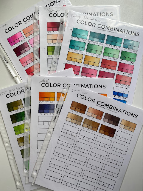
These sheets
are also from Sandy Allnock. I added them to my cart when I purchased my
hex chart, thinking I'd use them eventually.
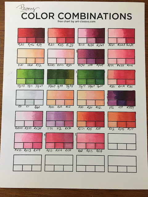

Then came The Peony Project a few years ago. I needed to swatch some
colors for a potential client. I put the pdf on a thumb drive and had
it printed on the cardstock I use for my Copic coloring. Once I had my
sheets I sat down and began swatching. I swatched the entire project on one sheet, as you can see below. The tiny "X" represents the color combos I used for the card order.

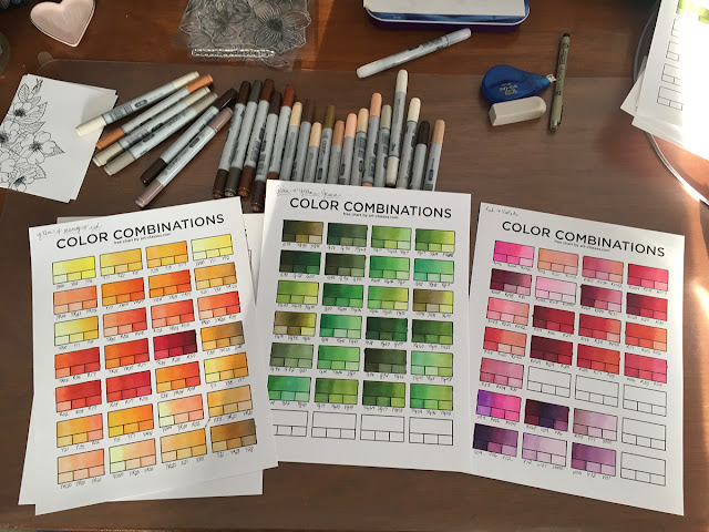
There are five versions of the color combinations sheet in the download and I use sheet five. These
sheets are perfect for two or three marker blends. If you're like
Kelly Taylor and
generally use four markers, you may need to keep shopping for the right swatch
chart to fit your blending style.
I love the way these sheets are set up. There is a space
to swatch the blend and smaller boxes for the individual
colors used. Rather than write the color number over top of the individual colors, I've opted to write the color below each box. Some of the colors are pretty dark and this was a
consistent way for me to label regardless of color.

You'll notice in the photo above each sheet has a note in the top left
corner. That note tells me if the combos were for, be it a special project or color testing. Swatch sheets give me a
space to experiment with bend and if I don't like it I put an "X" through it. I don't have to be neat, nor do
I have to stay in the lines. It also helps me keep track of blends I
really love, or in the case of the peony project, it gives me the ability to
pull prior combos to recreate from.
Learning to use Copic markers truthfully was the catalyst for changing my perspective on swatching. I now value color swatching. I'm currently working on a tag book that will swatch my Distress
Ink and Oxide blends. There really is value, and maybe a little magic,
in using color swatching, especially for color blending.
Comments
Post a Comment