Posts

Showing posts with the label Techniques Tried

Tying the Knot - Abstract and Florals

Image
I'm back with more abstracts.  I told you that I loved this technique!  I also recently bought some additional stencils specifically for this technique that I'll be sharing soon.  Why do I love this technique so much?  Let's start with the fact that there are so many design possibilities.  It lends a modern touch to cards when using soft colors.  It can make a statement with the use of bolder colors.  Layering colors and stamps never creates the same design twice.  Today's card is a soft modern take on a wedding card. I started this card with my Distress Inks and stencils.  I always build my abstracts by starting with the largest elements first, then filling in with smaller elements as I go.  This panel began with my largest shape and Bundled Sage, then I added Saltwater Taffy, and finished by adding Salvaged Patina to balance the composition.   I pulled a couple of Simon Says Stamp stamp sets from my stash and added my floral ...
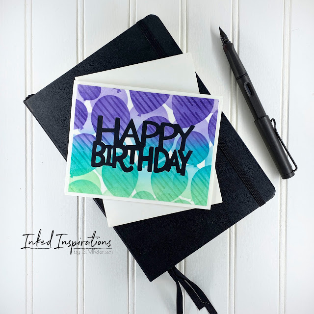
Inspired by Kelly - Two for One Balloon Cards

Image
The inspiration for these cards came from the archives of Kelly Taylor's videos -  Layering Balloon Stencil 5 Ways: Birthday Parties .  Knowing I had these stencils in my stash I dug them out and set out to ink blend a few panels.  I wanted to try a couple of the ideas I saw in her videos.   I ink-blended my balloons using Distress Ink in Villainous Potion, Peacock Feathers, and Cracked Pistachio onto my first panel.  I wanted to add more interest, so I pulled out another stencil and layered it over the second layer of balloons, while the balloon stencil was still in place, and added some tone-on-tone details.  Once I had a completed panel I wanted a bold sentiment, but instead of adding the sentiment over top of the panel, I opted for a die-cut inlay.  Which left me with the reverse, which I could have tossed or used later.  Instead, I made two cards for the price of one.   Rense and repeat.  This go round I used Mustard Seed,...

Learning to Use Card Sketches

Image
I've drawn my own sketches off and on over the years, very often to get an idea out of my head when I'm not in the studio to create.  I've never sought out card sketches, nor have I actually used them to build my cards, other than my own of course. Then a few weeks ago my Bestie over at By Grace Everett and I were talking about patterned paper and getting more than one or two designs from some of our patterned paper.  Which got my wheels turning.  I was trying to think of where we could get more inspiration to use our patterned paper, then it hit me.  We needed to watch a few of Kristie Marcotte's videos .   Fast forward to a couple of days ago when I was sipping my morning coffee and seeking inspiration.  I clicked on one of Kristie's older videos where she showed how to use one 6x6 paper pad to make 34 cards .  This is exactly what we needed to jump-start our patterned paper use.  She took one double-sided paper pad and eight card sketches...

Shopping Your Stash - Playing with Fun Folds and Windows

Image
Sometimes I see techniques and think "Nah, that's cute but not really for me", but then I hit a creative wall and pick something to challenge my creative ideal.  Fun folds and windows are two of those "Nah" techniques.   Before I go into the details of this make, I really want to encourage you to shop your stash.  Any dies and stamps will work for this technique combo.  Large shapes are great for windows and any cute stamp can peek through.  Color your image with your favorite medium.  I think flowers would be a fun window card peek through as well. This card started with the polka dot paper and inspired my color palette.  Jumping off from there, I pulled a second scrap of patterned paper and Copic colors that would fit my palette idea.  After I had a color palette I shopped my stamps and dies for further inspiration.   While shopping my stash, these cute Darcie's penguins came into view.  Bingo!  This little penguin in pi...

6 Distress Oxide Color Combo Ideas for Building Backgrounds

Image
When I get stuck creatively I will turn to building backgrounds. My go-to background technique is ink blending.  Ink-blended backgrounds create a lot of versatility in my stash.  If you've been with me a while you know I draw pen and ink trees, nearly every one of my trees is done on an ink-blended background.  I also use these backgrounds for building cards and die-cutting.   Today I'm sharing some of the color combos I've experimented with recently.  All of these blends were created on sheets of 6 x 9 inch watercolor paper, created by cutting the Canson sheets in half.  I blend on any number of paper, but when I know I'm going to use heavy water I opt for a watercolor paper or mixed media paper that can take the wet medium.   Color Combo #1: Chipped Saphire Pine Needles Cracked Pistachio I ink-blended this trio and then splattered clean water over top.  I like the dark rings around the water spots so I will splatter my water and let ...

Inspired by Mindy Egan - Abstract Card

Image
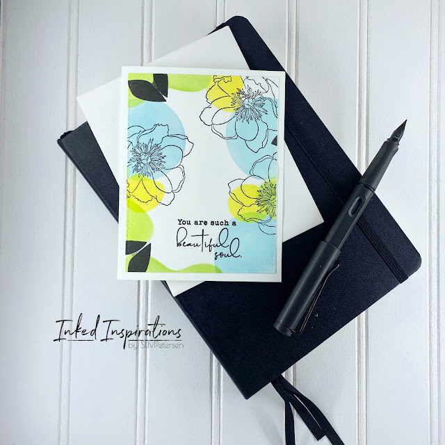
When I saw Mindy Egan's  Abstract Art for Clean & Simple Cards video I knew I had to see what was in my stash to create abstract cards with.  As I shopped my stash, I remember the Taylored Expressions Abstract stencils and stamps set I had.  I also pulled out my Tim Holtz flower Garden stamp set. I picke a few Distress Inks to build a bright pallet that would lend itself to a modern floral pattern.  The colors I chose to work with were Salvaged Patina, Squeezed Lemonade, and Twisted Citron.   Working with the large semicircle stencil I began my pattern with Salvaged Patina.  I pulled the smaller more jelly bean-shaped stencil for Twisted Citron and completed my ink blending with a second smaller semi-circle and Squeeze Lemonade.   After laying down my colors for a border selected the more open large petal flower from the Flower Garden stamp set.  I added them in a pattern that would overlap more than one color as well as leave a bit of white ...

Technique Tried - Watercoloring Floral Focal Point

Image
I watched Erum Tasneem's video - Watercoloring Altenew Statement Florals a couple of months ago and fell in love with the card idea. It just took me a little while to get around to trying the technique.   I really love this card and how it turned out.  For my version of this technique, I switched the orientation of the flower to the bottom and faded my blue background up. To start the card I stamped the Wild Peonies in VersaFine ink on Canson XL watercolor paper.  I used clear embossing powder, as I never have good luck with black.  Once my image was embossed I pulled out the watercolors. I kept the colors simple and used water to keep my shading simple, more water for lighter colors, and less water for more intense colors.  I used Windsor and Newton Cotman watercolors in Sap Green, Purple Lake, Cadmium Yellow, and Intense Blue. To complete the card I the Simon Say Stamp Happy set and the Avery Elle Sentiments Too set to build the sentiment Happy Annivers...

Techniques Tried - Authentic Woodgrain

Image
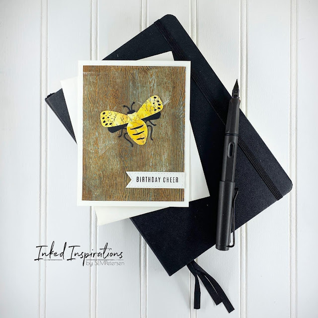
Woodgrain paper might be one of the more interesting papers in my stash of goodness.  Tim Holtz knew what he was doing when he brought this to market.  I've used it for any number of Christmas card projects, and my go-to look was as a white-on-white kind of background, but then I watched  Tim Holtz's video Demo:  Distress Paint .  Magic was sparked. The idea for this card actually started with the bee I'd cut and pieced together.  The yellow wings and body were cut from a background in my stash.  I often make backgrounds for use later in projects like this.  I had visions of putting this bee on wood as if it had landed on an old fence or barn.  The idea grew from there with the decision to make a set of cards using all of the bugs in the die set. While I don't yet own any sprays I was able to create beautiful woodgrain with my Distress Inks & Distress Oxides to build my wood color.  I used a combination of blending tools and ink pads...

Inspired by - Yana Smakula

Image
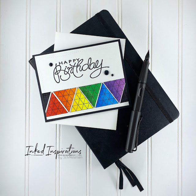
I'm often inspired by other makers and their ideas. Yana Smakula has a unique style and I can pick a Yana card out of any lineup, she is great at using smaller images to make an impact on cards.  When I watched one of her older videos,  5 Ways to Stamp Backgrounds (not using background stamps) , I was inspired to use some of my smaller stamps.  While I didn't create a background on this card, I created a focal image using just one small stamp. The magic here is not only in using a small stamp on repeat, it's also a stamp from an older Hero Arts Christmas stamp set.  I rotated the triangle each time I stamped to create a geometric focal point, using Gina K Amalgam ink.  Then came the rainbow of Copics to color the images and make them pop. The large birthday sentiment from Creative Expressions balances the card panel.  I used the Wonky Rectangles from Simon Says Stamp to add the faux stitching.  The panel was mounted on a black card base and I added b...

Shop Your Stash - Big Butterflies

Image
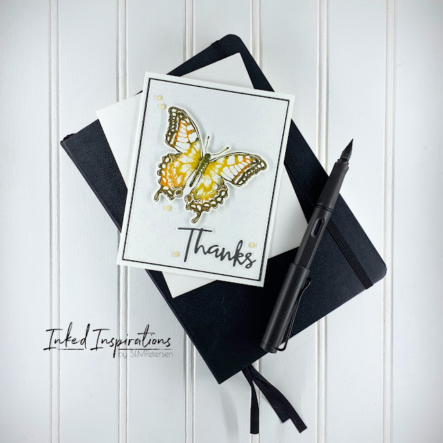
Today's card is a revisit of the same Gina K Multi-Color Inking that I used in this Techniques Used post and in this butterflies card .  I'm sharing the third look at this technique to share how different stamps will give you variations.  I have three cards in this post today. I'm not ashamed to admit this was the first time I used this big butterfly.  It's from a Sixix & Tim Holtz exclusive for Michael's, that I've had for years.  When I say shop your stash, I want you to know that I practice what I preach.  I used the same butterfly stamp with its coordinating die on all three cards.   The two yellow/orange blend butterflies were created with Distress Inks in Pumpkin spice, Fossilized Amber, and Black Soot.  I really love the way the Distress Inks work in this technique.  The blue butterfly was inked with Gina K. ink in Ocean Mist, Tranquil Teal, and In the Navy. I wanted the butterfly to be the focal point of these cards so I kept the...