Posts

Showing posts with the label Watercolor

Brushes with Bree 2025 Advent Calendar Part 2

Image
In the last post I shared my 24 watercolors from following the Brushes with Bree 2025 Advent Calendar.  Today I’m sharing the pieces I created layering some of the completed pieces to create different compositions and small scenes. Day 1 & 2 Day 1 & 7 Day 1, 2 & 9 Day 1, 7 & 8 Day 12, 13 & 14 Day 1, 2 & 15 Day 14 & 18 Day 1, 2, 9, 15 & 19 Day 9 & 19 Day 12 & 21 Day 14, 18, & 21

Brushes with Bree 2025 Advent Calendar Part 1

Image
I’ve had a goal to create a daily art practice for a while now, but this year came with a lot of changes.  Hubby retired, we moved into our fifth wheel, we sold our house and left Alaska, we started chasing the sun and traveling.  All of which kicked my goal of a daily art practice to the back burner.   December rolled around and I felt like we finally had a bit more of a routine in our life of living on the road, so I treated myself to a digital advent calendar.  Each day I opened a new Procreate tutorial focused on watercolor techniques.  These are the results of that daily, or nearly daily practice, as some days we were busy so I would have to play a little catch up.  I really enjoyed the challenge of creating all of these pieces.  In the next post, I’ll share the projects I created layering some of the competed pieces to create different compositions.   Day 1 - Holly Day 2 - Hot Cocoa Day 3 - Cherry Pie Day 4 - Striped Bow Day 5 - Cranberri...

Watercoloring the MFT Floral Fantasy

Image
Watercolor is a technique I love, but it's a challenging technique that I'm always learning.  The only thing I know for sure is no matter how many times you work with watercolor you will never get the exact same results twice. I used the same technique for this Floral Fantasy card that I did when creating the peonies in the Technique Tried - Watercoloring Floral Focal Point post.  What I learned while watercoloring this image was that adding shading was a bit more challenging.  This image has a lot of details drawn in by the illustrator.  By heat embossing the image, I created a lot more nooks and crannies to paint.  I feel like this image will lend itself to coloring more easily without the heat embossing. The end result made for a pretty card, but I wouldn't use this technique with this image again.  In the future, I would stamp and color with watercolor or Copics, or I would heat emboss it in a metallic for a clean and simple elegant effect.  The ...

Watercolor Lilly

Image
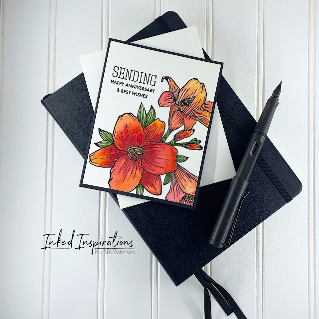
It's good to revisit old techniques. I often get caught up in what's trendy and new and forget about old favorites.  Watercoloring with heat embossing is something I've done off and on throughout my decades of card making.   I stamped this image in VersaFine black ink, onto watercolor paper and added clear embossing powder over top.  I've found using black ink and clear embossing powder will get you the best black embossing.  Black embossing powder is much fussier and less reliable.   The heat embossing technique creates a nearly foolproof way to watercolor an image.  The heat embossing creates a resist that builds wells for color to settle into.  For these lilies, I was able to paint all the petals without waiting for areas to dry because the embossing kept the petals from bleeding into each other.   I stamped my sentiment from a combination of Simon Says Stamp and Avery Elle stamp sets.  To complete the card, I trimmed the p...

Poppies Mixed Media Card

Image
I’ve been watching several Vicki Boutin Videos lately and this card was influenced by what she refers to as a kissing technique.  After watching this video , where Vicki used her art crayons to color onto acetate, then applied water with a wet paintbrush I was intrigued to experiment.  From there she turns the acetate over and kisses it on the paper.  As Vicki says “kiss it like your grandma, not the Rock”.  I already had an image stamped and heat embossed on watercolor paper, just waiting to be used.  Let the kissing begin! There are no Vicki Boutin Art Crayons in my stash, but I do have a small set of Neocolor II water-soluble wax pastels.  I pulled them out and figured I would get a similar effect using the same technique.  I simply scribbled a bit of the crayon onto my sheet of acetate, added water with a paintbrush, carefully turned the acetate over, and gently kissed it to the panel I had.  Once I built the background I used my wet paintbru...

Technique Tried - Watercoloring Floral Focal Point

Image
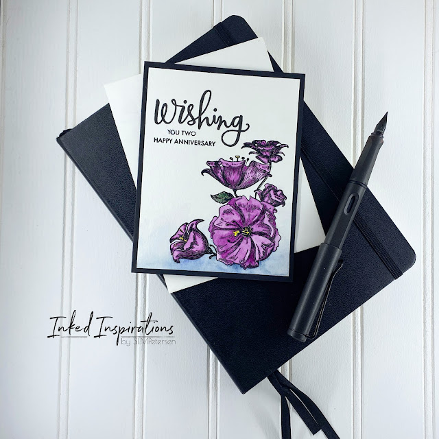
I watched Erum Tasneem's video - Watercoloring Altenew Statement Florals a couple of months ago and fell in love with the card idea. It just took me a little while to get around to trying the technique.   I really love this card and how it turned out.  For my version of this technique, I switched the orientation of the flower to the bottom and faded my blue background up. To start the card I stamped the Wild Peonies in VersaFine ink on Canson XL watercolor paper.  I used clear embossing powder, as I never have good luck with black.  Once my image was embossed I pulled out the watercolors. I kept the colors simple and used water to keep my shading simple, more water for lighter colors, and less water for more intense colors.  I used Windsor and Newton Cotman watercolors in Sap Green, Purple Lake, Cadmium Yellow, and Intense Blue. To complete the card I the Simon Say Stamp Happy set and the Avery Elle Sentiments Too set to build the sentiment Happy Annivers...

WPlus9 Beautiful Butterflies - Heat Embossing with Watercolor

Image
Watercolor is kind of a magical medium to work with and when combined with heat embossing it can create some beautiful results.  When a heat embossed image is used, the margin of error is diminished, and the color will stay in the well created by the embossing.  The exception to this is if too much water is added to the well and it overflows. Today’s card was created by heat embossing two butterflies.  I used Windsor and Newton Cotman watercolor in Indian Red for the butterflies, adding gold details with Prima Metallic watercolors.  I used Windsor and Newton Cotman Phalo Blue and a lot of water to create the effect of a sky for the background.  Before stamping the sentiment I covered the butterflies and splattered a bit of blue metallic from the same Prima Metallic watercolor palette. The sentiment is from the Simon Says Stamp Congratulations stamp set, stamped in VersaFine black ink.  When I use watercolor paper for my card panels I always opt for a heavie...

Color Swatching

Image
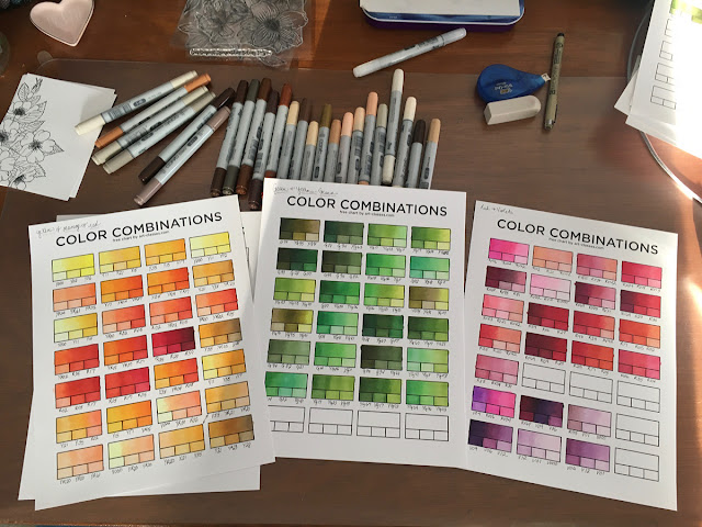
Color swatching is fairly new to me. I've only recently found the value in color swatching markers, paints, pencils, inks, etc. Up until a couple of years ago I never really saw value in this practice. So what changed? Honestly, joining the Copic marker cult. Yes, I said cult, because well these markers do kind of have a cult following.   Copic markers are alcohol markers, the medium I turn to most often when creating my hand-colored cards. These markers are designed to blend and create depth when coloring. They're transparent and layering the colors creates a lot of definition. About a year ago I actually started keeping track of color combinations for blending. Color swatching is about more than just a patch of color on a substrate. While trying colors on the substrate you'll be using is very helpful, I find more value in swatching when it comes to mixing or blending colors. This gives me a chance to try the combination to see if I get magic or mud out of it. ...

Watercoloring to Clear My Head

Image
At the end of last week, I kind of fell off the wagon of consistent blogging. I had a bit of an odd week with some things and I didn't plan far enough out to have a post for you on Friday.  To clear my head I spent Wednesday watercoloring and creating a few new pieces of art.  I got a custom order on Thursday, so knocked that out on Friday.  Then spent the weekend working on a color mixing chart and starting seeds for our garden this year.  So enough housekeeping, let's get to the meat of the post. I started watercoloring in 2019 when I found Let's Make Art.  I've talked about Let's Make art before and you can read about the start of my watercolor journey here .  I'm still learning and still love the LMA tutorials .   This past week I started my watercoloring projects with the duck.  Not gonna lie I struggled with this one a little, "painting" white animals or objects is never easy.  In the end, the results were satisfying, but only aft...

Watercoloring to Recharge

Image
In an effort to recharge my creative juices I've taken a break from cards to create some watercolor art.  This will might also be the only blog post for the week, with the holidays fast approaching.  I can't believe Christmas is Friday!  This crazy year seems to have flown by in spite of all the weirdness. I started really getting into watercolor in February of this year.  I kind of got hooked after watching a couple of Let's Make Art Videos .  They make it very easy for you to start learning with what you already have on hand, or you can order one of their kits.  LMA also has a monthly subscription box, which is amazing if you're looking to get started with watercolor.   Over the weekend I finished a moose I had in a watercolor pad that I started late last February, but had never finished.   I also completed a truck that I had outlined onto watercolor paper but never started.   Finally, I started a pair of cowboy boots with gr...